Graeter’s Ice Cream
Software: Adobe Illustrator and Photoshop
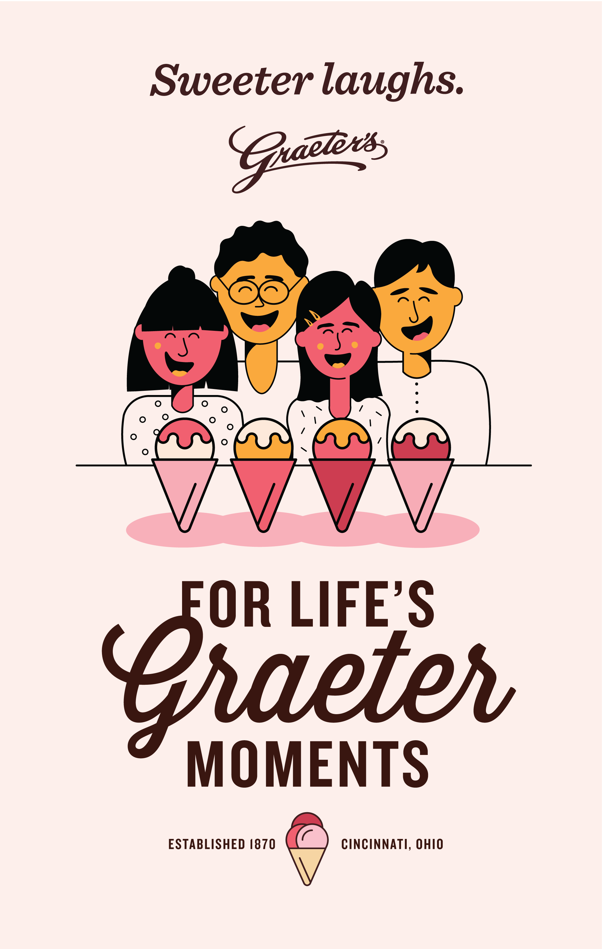
Client: Graeter’s
Year: 2022
We recommend elevating this aspect of the business. Graeter’s is both good for the world and your community. Here, the ice cream cone is fashioned to look like the earth signifying sustainability through giving.
The second G, Graeter Giving, showcases corporate and consumer gifting, an area we have identified as ripe for expanded growth. The ice cream cone here is topped with a bow signifying gifting.
The third G, Graeter Gathering, showcases community and family. The ice cream cone here is filled with three scoops signifying sharing. We have devised solutions to increase the gathering message that we will define in our party room and third space redesign of the Oxford, Ohio location.
My job on the blue sky team was to focus on the third G, the Graeter Gathering, specifically the in-store experience — planning and designing a space that felt more inviting and modern in order to attract younger audiences. With that said, I redesigned the Oxford scoop shop that is based in a college town full of younger audiences, college students.
I started this project by creating mood boards to present to the CEO, Rich Graeter, and his team. We established Starbucks as a critical competitor because Starbucks is a place where people gather and hang out. As an example, I took the liberty to rethink or reimagine the Oxford scoop shop using the existing scoop shop and brand guidelines.
I wanted to stick to a neutral palette that would still look cohesive with the Graeter's brand and their current colors. I decided to combine the two mood boards to truly capture the new and improved aesthetic of Graeter’s and the placement of couches will help optimize the space.
During my time at Miami University, I was fortunate to gain client work experience by working with Graeter’s Ice Cream. Graeter’s charge tasked our class with defining areas that would allow them to reach a younger audience. In order to achieve a set of more comprehensive resolutions, we divided into the following groups, social media, corporate gifting, UI/UX, and blue sky, researching various channels and completing market analyses of key competitors to determine researched solutions. I worked on the blue sky team which was a team that allowed my group total and complete freedom.
My team came up with a campaign referred to as the Three Gs. The first G, Graeter Good, showcases company efforts, like Perfect Indulgence, which speaks to sustainability, and Graeter’s philanthropic efforts. We know that Graeter’s is engaged in a high level of philanthropy. We also know that Gen Z consumers value a company’s philanthropy. However, up until now Graeter’s has been relatively humble about its philanthropic efforts.